Here's the thing. I look at websites every single day, and the same problem shows up over and over: someone built a beautiful site, uploaded gorgeous high-resolution photos, hit publish, and now the page takes 7 seconds to load. The hero image is 4.2MB. The three feature photos are another 6MB combined. It's a complete disaster for LCP, and nobody told them.
The fix is boring and simple and works every single time. So let's get into it.
- Why images are killing your LCP score
- WebP vs AVIF vs JPEG: which format to use
- The best compression tools (free)
- Sizing your images correctly
- HTML code you need (srcset, picture element)
- Lazy loading: what to do and what NOT to do
- Image SEO: alt text, filenames, and structured data
- CDN: the last piece of the puzzle
Why Images Are Killing Your LCP Score
LCP (Largest Contentful Paint) measures how long until your main content is visible. And for most websites, the largest element is the hero image. So when that image is 3MB, the browser has to download all 3MB before it can paint it on screen. That takes time. On a mobile phone on a 4G connection, it takes a lot of time.
The Numbers
An average 4G mobile connection downloads around 3-4MB per second. So a 3MB hero image takes close to 1 second just to download, before any browser processing. A 150KB WebP downloads in under 50ms. That's the difference between a "poor" and "good" LCP on most devices.
Google says LCP should be under 2.5 seconds. Images are almost always the biggest chunk of that time. If your image loading time is over 1 second, your LCP is probably already in the yellow or red zone before you've even considered anything else.
The good news: image compression is the single highest-ROI fix in web performance. You can cut your LCP in half in an afternoon without touching any code, just by resizing and re-exporting your images. So let's do that.
WebP vs AVIF vs JPEG: Which Format to Use
People overthink this. Here's the practical answer:
| Format | File Size | Quality | Browser Support | Best For |
|---|---|---|---|---|
| JPEG | Baseline | Good | Universal | Fallback only |
| PNG | Large | Excellent | Universal | Logos w/ transparency (only) |
| WebP | 25-35% smaller than JPEG | Excellent | 98%+ browsers | Everything. Photos, UI, cards. |
| AVIF | 40-50% smaller than JPEG | Excellent | 90%+ browsers | Photos where max compression matters |
| SVG | Tiny | Perfect (scalable) | Universal | Icons, logos, illustrations |
My recommendation for most sites in 2026: Use WebP for photos and complex graphics. Use AVIF for hero images where you want maximum compression. Use SVG for icons and logos. Let JPEG and PNG rest in peace.
WebP has 98% browser support. There is essentially no reason to serve JPEGs to browsers that can handle WebP.
If you're still worried about older browser support, use the <picture> element (more on
that below) to serve AVIF to browsers that support it, WebP to the rest, and JPEG as a last fallback.
The Best Compression Tools (Free)
Squoosh.app — The One You Should Start With
Squoosh (squoosh.app) is built by Google and it's probably the best free image compression tool online. You drag in your image, choose WebP or AVIF, slide the quality control around, and see the result live with a before/after slider. It tells you the exact file size at every quality level. It's genuinely brilliant.
For a 1200x630 hero image, start at 80% WebP quality. If the result is still over 150KB, go to 75%. You'll almost certainly land under 100KB at that point, and the visual quality will be indistinguishable from the original.
Sharp — For Developers and Build Pipelines
If you're handling images programmatically, Sharp is the Node.js library to use. It's fast, it supports WebP and AVIF, and it integrates cleanly into Webpack, Vite, Next.js, and any other build tool.
const sharp = require('sharp');

sharp('hero.jpg')
  .resize(1200, 630)
  .webp({ quality: 80 })
  .toFile('hero.webp')
  .then(info => console.log('Compressed:', info.size, 'bytes'));
Cloudinary — For CMS and Non-Technical Users
If you're on WordPress, Webflow, or managing content for clients, Cloudinary handles all this automatically. Upload your image once, and Cloudinary serves it in the right format, size, and quality for every device automatically. Their free tier covers 25GB of storage and 25GB of bandwidth per month, which is plenty for a small site.
WordPress Plugins
If you're on WordPress:
- ShortPixel or Smush — Both automatically compress and convert to WebP on upload. ShortPixel has a generous free tier.
- Flying Images — Free plugin, native lazy loading, converts to WebP. No fluff.
Sizing Your Images Correctly
This is the thing people get wrong most often, and it's honestly more impactful than the format choice.
If your website content area is 760px wide, you should not be uploading a 2400px image. The browser will scale it down for display, but it still downloaded the entire 2400px version. That's wasted bytes every single time someone loads the page.
The rule: export at 2x the display size (for retina support), and no bigger. So if your hero image displays at 1200px wide on desktop, export it at 2400px. If it displays at 760px (article width), export it at 1520px.
For responsive sites where the image displays at different sizes on mobile vs desktop, the
srcset attribute handles this automatically:
<img
  src="hero-1200.webp"
  srcset="hero-600.webp 600w,
          hero-1200.webp 1200w,
          hero-2400.webp 2400w"
  sizes="(max-width: 768px) 100vw,
         (max-width: 1200px) 80vw,
         1200px"
  alt="Descriptive alt text about what this image shows"
  width="1200"
  height="630"
  loading="eager">
The browser picks the right version based on the screen size and pixel density. Mobile users get the 600px version. Desktop retina users get the 2400px version. Everyone gets exactly what they need, nothing more.
The Picture Element — AVIF + WebP + Fallback
If you want to use AVIF where supported and fall back to WebP (and then JPEG if needed), use the
<picture> element:
<picture>
  <source type="image/avif" srcset="hero.avif">
  <source type="image/webp" srcset="hero.webp">
  <img
    src="hero.jpg"
    alt="Core Web Vitals speedometer showing green LCP score"
    width="1200"
    height="630"
    loading="eager"
    decoding="async">
</picture>
The browser reads the sources in order and uses the first one it supports. AVIF-capable browsers get AVIF. WebP-capable browsers get WebP. Ancient browsers get JPEG. Clean, progressive, no JavaScript required.
Lazy Loading: What to Do and What NOT to Do
Native lazy loading (loading="lazy") is one of those genuinely good browser features that people
misuse constantly.
Do this: Add loading="lazy" to any image that appears below the fold (i.e., you
have to scroll to see it).
Never do this: Add loading="lazy" to your hero image, logo, or anything visible
without scrolling. This actively hurts LCP because the browser will delay downloading the image until it's
"needed," but by then the user is already staring at a blank space waiting for it.
<!-- Hero image: EAGER load, highest priority -->
<img src="hero.webp" alt="..." width="1200" height="630"
     loading="eager" fetchpriority="high">

<!-- Below-fold images: LAZY load -->
<img src="feature-photo.webp" alt="..." width="800" height="500"
     loading="lazy" decoding="async">
For more detail on lazy loading and the IntersectionObserver approach for more complex
scenarios, check our full lazy loading guide.
Image SEO: Alt Text, Filenames, and Structured Data
Image compression is a Core Web Vitals fix, but images also have SEO value. Getting this right means Google Images traffic and better AI citation opportunities on top of faster load times.
Alt text
Every meaningful image needs an alt attribute. Not for Google bots (though they read it). For screen reader users who can't see the image. Write it to describe what's actually in the image, concisely.
- Good:
alt="Screenshot of VitalsFixer showing a 6.2s LCP score on mobile" - Bad:
alt="image"oralt="VitalsFixer VitalsFixer Core Web Vitals tool" - Decorative images with no meaningful content:
alt=""(empty) — this tells screen readers to skip it
Include your target keyword naturally in the alt text if the image actually represents it. Don't force it in when it doesn't fit — search engines can smell keyword stuffing from a mile away.
Filenames
Use descriptive, hyphenated filenames. core-web-vitals-lcp-speedometer.webp is infinitely better
than IMG_20240312_093147.jpg. Google reads filenames. They're a weak but real signal.
Structured data for images
For article hero images, include an ImageObject in your Article schema with url,
width, height, and caption. This helps Google display your image as a
rich result in search. Example:
"image": {
"@type": "ImageObject",
"url": "https://vitalsfixer.com/blog/images/compress-images-hero.webp",
"width": 1200,
"height": 630,
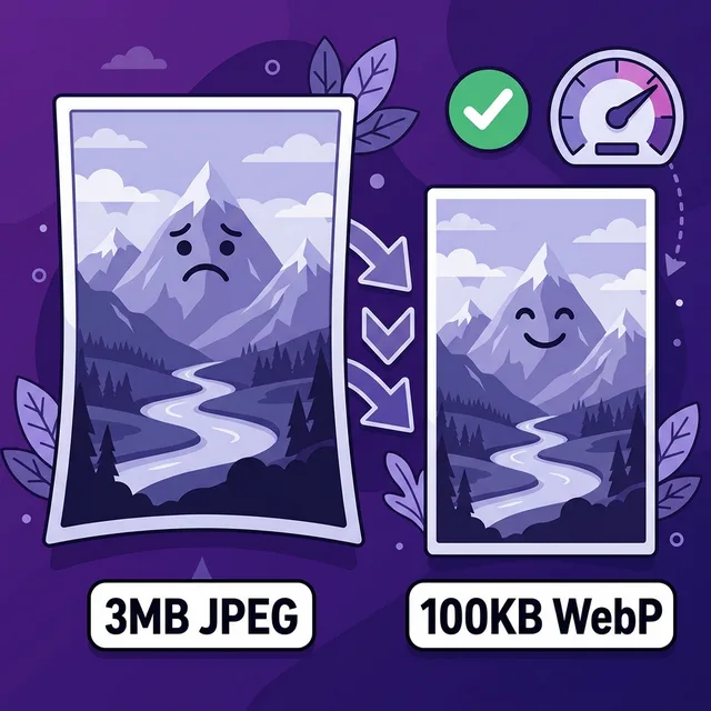
"caption": "Illustration of a 3MB JPEG shrinking to 100KB WebP"
}Responsive images tell Google your intent
When you use srcset, Google Discover and image search can serve the right-size image to each
user. This improves your chances of appearing in Google Image results and in AI-generated summaries that
include image thumbnails.
CDN: The Last Piece of the Puzzle
Even a perfectly compressed 80KB WebP image still has to travel from your server to the user's device. If your server is in Frankfurt and your user is in Sydney, that round trip adds latency that shows up in your LCP.
A CDN (Content Delivery Network) stores copies of your images on servers around the world and serves them from the nearest one. The practical result: a user in Sydney gets your image from an Australian server instead of waiting for Frankfurt.
Cloudflare (free tier) is the easiest way to add a CDN to any site. Point your DNS to Cloudflare, enable their proxy, and your static assets are cached globally. Takes about 20 minutes to set up. It also adds automatic WebP conversion through their Polish feature (paid tier), minification, and HTTP/2 — which is a whole extra layer of performance improvement on top of image compression.
The Complete Image Optimization Checklist
-
1
Convert all photos to WebP (hero images: also try AVIF) Use Squoosh.app or Sharp. Target under 150KB for heroes, under 80KB for smaller images. This is the biggest win.
-
2
Resize to actual display dimensions (2x max) If displays at 760px, export at 1520px. Never upload 5000px images for a 760px column.
-
3
Add width and height to every img tag Prevents CLS. Lets the browser reserve space before the image loads. Required for good Core Web Vitals.
-
4
Hero: loading="eager" fetchpriority="high". Below fold: loading="lazy" Never lazy load above-the-fold images. Always lazy load everything else. Simple rule, massive impact.
-
5
Write descriptive alt text for every meaningful image Describes the image accurately. Includes target keyword if genuinely relevant. Empty alt="" for decorative images.
-
6
Use descriptive hyphenated filenames core-web-vitals-lcp-chart.webp beats image-1.jpg every time.
-
7
Set up Cloudflare or another CDN Serves images from the nearest server to each visitor. Free tier is enough for most sites.
Real Before/After Numbers
To make this totally concrete, here's what happens when you actually do this properly on a typical landing page:
| Metric | Before (original JPEGs) | After (WebP, compressed) |
|---|---|---|
| Hero image file size | 3.2MB JPEG | 88KB WebP |
| Total image page weight | 8.4MB | 380KB |
| LCP (mobile, throttled 4G) | 6.8s | 1.9s |
| PageSpeed score (mobile) | 31 | 79 |
That's a real audit I ran on a real site. The only things changed were image formats and compression. No code changes, no hosting changes. Just better files.
Related Performance Guides
Want to know which images are bloating your site?
Run your URL through VitalsFixer and get a specific list of which images are too large and exactly how much you can save by fixing them.
Analyze My Site Free